


Digital Art
-
- April 2, 2024
Though photography is pleasurable, crafting graphics with your own imagery can be equally enjoyable. It is something I should engage in more often, yet the process of capturing, editing, and publishing images can be time-consuming.
Recently, I ventured into designing digital art, mixing my personal images with AI-generated graphics to enhance my creations. Drawing inspiration from the themes and narratives associated with different rides, I formulated my own designs. It was during this design process that I noted how ideas naturally evolved, enhancing the overall outcome.
Presented below are several of my designs, accompanied by an explanation detailing the conception and development of my ideas.


SMILE. ALWAYS.
Inspired by the Ministry of Joy’s innovative approaches to spreading happiness, the base colours of black and yellow were chosen to complement the ride’s overall colour scheme. The prominent use of yellow tones, evident in warning signs and hazard tape, further underscores the industrial theme of this coaster. One might wonder: are the hazard signs provided for our safety, or do they hint at the thrills that await within? The font used also corresponds with that used on the attraction.
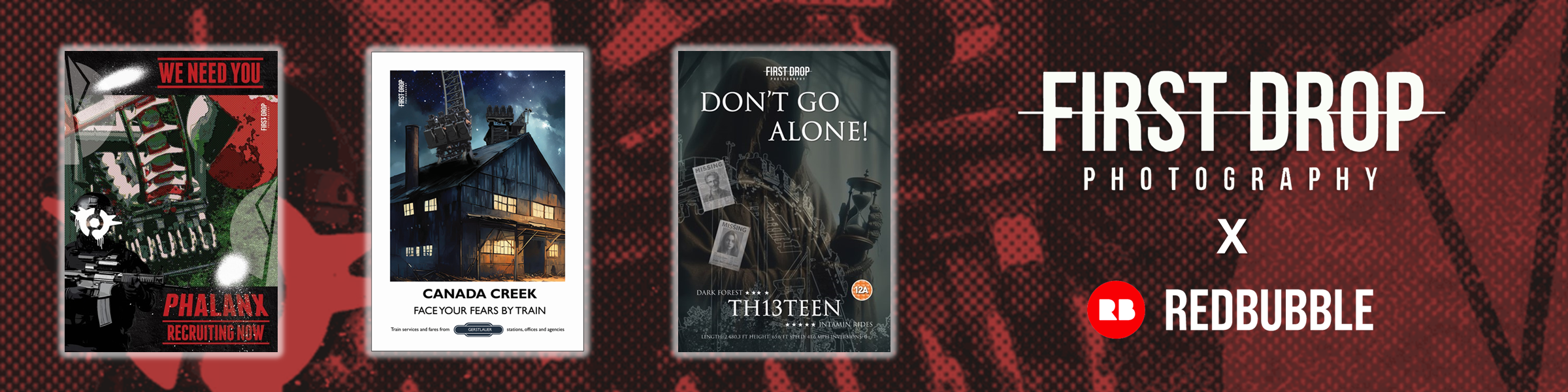
DON’T GO ALONE
Out of all the designs, the “Don’t Go Alone” design underwent the most significant development during its creation process. Originally, the image primarily featured trees to enhance the forest’s darkness. However, I opted to merge one of the resort’s main myths by including a Wraith figure in the background. Holding a timer and surrounded by missing posters, it injects a sense of mystery. Has the Dark Forest consumed them? Did the Wraith lure them into a trap?
When assembled, the design resembled a movie poster. Therefore, adding a 12A logo (also a nod to the PR stunt used during opening) contributed to the sensation of stepping into your own horror movie!
STEALTH
Transport yourself back to the 1950s with this retro design. Carefully selected fonts, phrases, and colours echo the era and ride theming found within the area. The main image is tinted sepia to evoke a sense of age and nostalgia. Initially, a different image of Stealth diving down was used, but it appeared unnatural within the design. Consequently, a more horizontal shot of Stealth was applied, captured just as it exhilaratingly exited the dive!
FACE YOUR FEARS
Inspired by the phrase adorning the side of Saw: The Ride’s trains, “Face Your Fears” takes centre stage in this design. Although not an exact match, the font mirrors hand-painted text, lending a raw quality to the graphic. The addition of gaffer tape (absent in the original design) evokes Jigsaw’s presence, while the iconic red spirals are synonymous with the film franchise. The use of red also echoes the colour scheme of the logo and conveys a sense of blood. Behind the image of Saw hurtling down its beyond-vertical drop, shackles subtly emerge, further enhancing the design’s ominous atmosphere.
RITA WINS
Drawing inspiration from vintage motorsport magazines of the 1950s, this design encapsulates a nostalgic aesthetic. Initially, a different image of Rita was used in the design process. However, upon completion, it became apparent that it didn’t align with the desired sense of nostalgia. Studying 1950s magazines, it was noted that Ferodo Brakes were frequently advertised on the front covers. Nevertheless, for this design, I opted against this route. Instead, I paid homage to Thunder Rock by incorporating a subtle black bar beneath the image.
DRAGONS FURY
At the outset, this design began in a basic fashion. It was simplistic and, frankly, quite uninspiring! The font lacked appeal, and the theme was ambiguous. However, through some refinement, the essence of a Chinese dragon was infused into the design by incorporating fiery text and airborne embers. The train stands out prominently, with the poster displaying ride statistics that unmistakably signify its status as an exhilarating attraction!


