


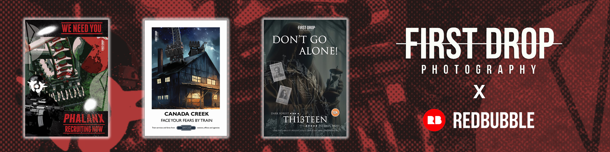
Digital Art Vol. 2
-
- April 13, 2024
As you will know from my last post, I recently ventured back into designing graphics and digital art, mixing my personal images with AI-generated graphics to enhance my creations.
Below, are another six of my designs, accompanied by an explanation detailing the conception and development of my ideas.


THE END IS COMING
Amidst a post-apocalyptic setting, Thorpe Park finds itself plagued by an aerial alien force known as The Swarm. To express a darker ambiance, I imagined a black-and-white theme, interrupted by the presence of an enigmatic figure wearing a gas mask and hoodie. Are they a civilian caught in the chaos, a member of a resistance movement, or perhaps a military operative? In the background, The Swarm hurtles down its initial descent against a backdrop of ominous clouds, each abducted passenger marked off as a casualty of the alien onslaught.
FEEL THE HEAT
Embracing a timeless and straightforward design, Nemesis Inferno at Thorpe Park stands in stark contrast against the rugged rock formation and plain background. The font mirrors the style featured in the Nemesis Inferno logo, while the phrase “Feel the Heat” further accentuates the intense and fiery essence of the ride.
GOODNIGHT. DON’T LET THE VAMPIRE BITE!
Given that The Vampire is primarily aimed at families, it was crucial to avoid any dark overtones in the design, which could easily evoke the Transylvanian and vampire horror theme. A considerable amount of thought was put into opting for a cartoon comic strip style that would appeal to both young and old without conveying any sense of threat. Three images, shaded in reds and purples, were accompanied by a specially designed cartoon vampire outlined in white, while a chandelier was included above, cleverly referencing the original theming once present in the station. To round off the look, cartoon fonts and text boxes were seamlessly incorporated.
A VAULT SEALED FOR TWO CENTURIES
The entrance image of Hex remained untouched for this design, as its eerie green glow effectively conveyed the mysterious allure of the ride. Taking an unconventional approach, I opted to break up the text lines, allowing them to overflow. This choice was deliberate, aiming to reinforce the disorienting nature of the ride. The line “A Vault Sealed for Two Centuries” adds an air of curiosity, inviting speculation about the secrets hidden within.
DON’T LOOK DOWN
To capture the essence of Oblivion’s debut in 1998, I aimed to capture the atmosphere of the TV advertisement aired during that era with this design. Infusing a dark tone into the image, I highlighted the main catchphrase in orange, using a font reminiscent of the ride’s branding. Fortunately, the design captures an industrial essence, as intended, staying true to the era it represents.
CLOSE YOUR EYES… MAKE A WISH
Those who have experienced Center Parcs during its Christmas or Winter Lights event can testify to the enchanting displays that greet guests at each village throughout the UK and Ireland. To encapsulate this magic, multiple images were used to highlight some of the remarkable sights. The text “Close Your Eyes… Make a Wish!” serves to reinforce the atmosphere of wonder and delight.


